Want better performing videos? You’ll need custom thumbnails.
In fact 90% of the videos that perform the best on the platform have a custom thumbnail according to YouTube Help.
And, many of your viewers will decide whether to click on a video based solely on the thumbnail.
For podcasters expanding into video content, this becomes even more critical. Tools like RSS.com’s PodViz technology make it easier than ever to convert audio episodes into engaging videos.
But, without an effective thumbnail, even the best content can go unnoticed.
If you want your videos to get more watch time instead of scrolled past and ignored, keep reading!
What Makes a YouTube Thumbnail Effective?
Essential Elements of Click-Worthy Thumbnails
Effective thumbnails share several key characteristics that work together to capture attention and encourage clicks.
These characteristics include:
- Clear, readable text (under 50 characters)
- High contrast colors for mobile visibility
- Expressive faces/emotions (when relevant)
- Consistent branding across your channel
- High image quality (1280×720 minimum)
- Mobile-optimized design (most viewers are on mobile)
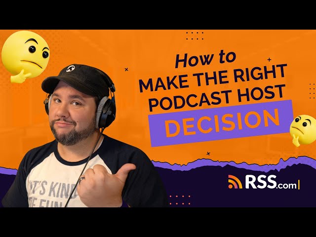
Here’s an example from one of the most popular video podcasts on YouTube, The Diary of a CEO:

Psychology That Drives Clicks
Understanding why people click on thumbnails helps you create more effective designs.
Here are several psychological triggers that consistently drive engagement:
- Curiosity gaps: “The Secret That…” or “What Nobody Tells You…”
- Problem/solution: “Stop Making This Mistake” or “Finally Fixed”
- Social proof: “Everyone’s Doing This Wrong” or “Proven Method”
- Urgency triggers: “Before It’s Too Late” or “Limited Time”
Pro Tip: Create thumbnails that deliver on their promise – misleading thumbnails hurt long-term channel performance.
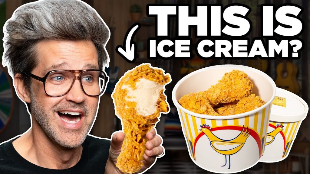
Check out this example from perhaps the most prolific weekday video podcasts online, Good Mythical Morning:
Why YouTube Thumbnails Matter More Than Ever for Podcasters
The Rise of Video Podcasting
YouTube now dominates podcast discovery, with many listeners preferring to watch rather than just listen.
This means audio-first creators must adapt their marketing to compete visually.
RSS.com’s PodViz technology converts audio episodes into engaging videos with chapter markers and animations.
But without an effective thumbnail, your podcast won’t get clicked.
Just like you need solid podcast cover art to be discovered in podcast directories, you need killer YouTube thumbnails for your video content.
First Impressions Count
Viewers scroll past hundreds of options on YouTube.
Your thumbnail is like a book cover. It must communicate value in milliseconds.
You’re competing with professional content from major media companies and established YouTubers.
Your design quality needs to match these standards to earn clicks from unfamiliar viewers.
Keep it simple! Think bold, clean designs because these consistently outperform busy thumbnails with multiple competing elements.
The Mobile Factor
With over 60% of YouTube viewing happening on mobile devices, your thumbnail design must work at small sizes.
Text that looks perfect on a desktop screen may become completely unreadable on a phone.
Every design choice should be tested at thumbnail size on a mobile device.
Colors that provide adequate contrast on desktop might blend together on smaller screens.
When in doubt, prioritize clarity and readability over artistic complexity.
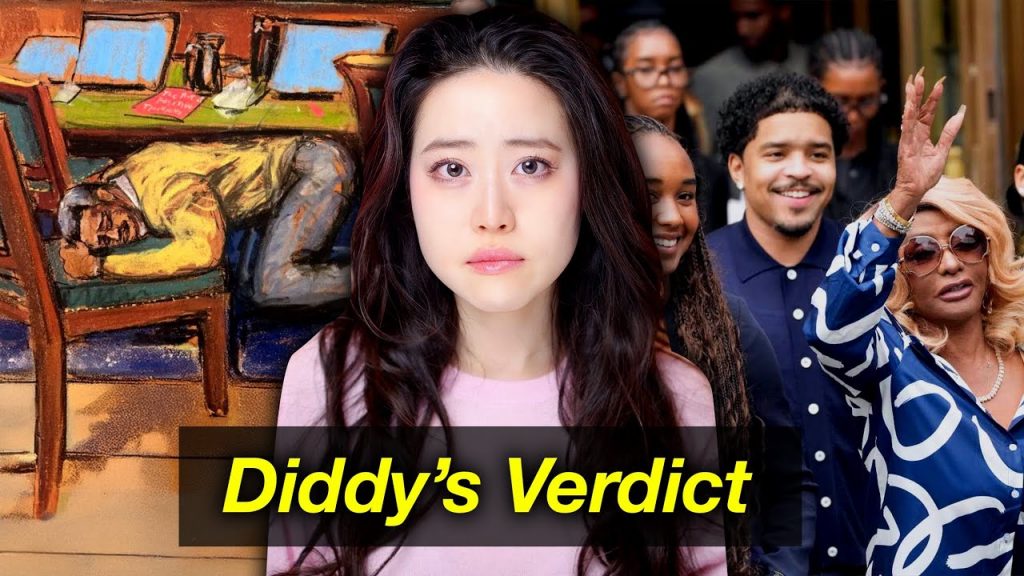
This example from the Rotten Mango Podcast would be easy to read on both mobile and desktop:
How to Create YouTube Thumbnails That Get Clicks
Step 1: Start With Your Content Strategy
Before opening any design tool, identify what makes your video valuable to viewers.
Your thumbnail should communicate this value proposition clearly and immediately.
Consider your target audience’s primary concerns and interests.
A thumbnail that appeals to marketing professionals will use different visual language than one targeting new parents or fitness enthusiasts.
Choose the primary emotion you want to trigger.
Educational content might focus on curiosity or problem-solving, while entertainment content could emphasize excitement or surprise.
Your thumbnail’s visual design should reinforce this emotional goal.
Step 2: Design Fundamentals
Text Optimization
Pay careful attention to both content and presentation.
Keep text under 50 characters to ensure mobile readability.
Use bold, easily readable fonts that maintain clarity even when compressed for web display.
Create strong contrast between text and background colors.
White text on dark backgrounds or dark text on light backgrounds typically work best.
Pro Tip: Avoid placing text over complex background images where it might become difficult to read.
Visual Elements
Visual elements should support rather than compete with your text.
Use high-quality images with a minimum resolution of 1280×720 pixels.
Maintain a consistent color scheme across your channel to build brand recognition over time.
When including faces in your thumbnails, ensure expressions are clearly visible and appropriate to your content’s tone.
Avoid cluttered compositions that try to include too many visual elements.
Color Psychology
Color psychology plays a significant role in thumbnail effectiveness.
For example:
- Red and orange convey urgency and excitement, making them popular for entertainment and news content.
- Blue suggests trust and professionalism, working well for educational or business content.
- Green implies growth and positivity, suitable for self-improvement or success-oriented topics.
Here’s a great example from the New Heights Podcast.
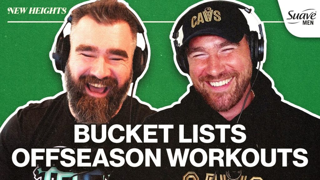
Notice the green background indicating it’s a positive and upbeat show.
High contrast color combinations improve readability and help your thumbnail stand out in crowded search results.
Test your color choices at actual thumbnail size to ensure they remain effective when compressed.
Step 3: A/B Testing Your Thumbnails
Create multiple versions of each thumbnail to test different approaches.
YouTube’s built-in analytics allow you to track click-through rates and determine which designs perform best with your specific audience.
Test different text approaches while keeping visual elements consistent, or try different visual styles with the same text.
Systematic testing helps you understand what resonates with your viewers and improves your future thumbnail performance.
Monitor click-through rates over time and iterate based on performance data. Successful thumbnails often share common characteristics that you can apply to future designs.
Tuulie: AI-Powered Thumbnail Creation
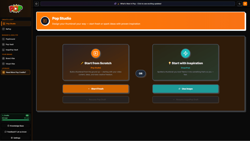
For creators seeking a psychology-driven approach to thumbnail creation, Tuulie offers an innovative platform that combines AI analysis with psychological principles.
Tuulie’s POP Studio feature provides an easy to understand workflow that starts with your video content and generates thumbnails that are optimized for clicks we’re all going after.
Tuulie works by analyzing your video description, script, or talking points to create text options based on psychological triggers proven to drive engagement.
Key Tuulie Features:
- Psychology-driven text generation creates six different text options, each with explanations of why viewers will click
- Brand consistency integration maintains your visual identity through Visual Vibe color settings
- Multiple design paths let you choose between inspiration-based design or full customization
- Face integration capabilities allow you to add reaction photos for personal branding
- Automatic optimization ensures thumbnails meet YouTube’s technical requirements
How Tuulie Works: The process begins with content input where you provide your video description, script, or talking points.
The AI then generates six psychology-driven text options, each designed to trigger specific viewer responses like curiosity, urgency, or social proof.
You then choose between featuring your face or keeping the design faceless.
Next, select either an inspiration-based approach using successful thumbnails as references or full customization with complete control over backgrounds, text styles, and colors.
The system will generate two unique variations based on your specifications, each optimized for YouTube’s format and mobile viewing.
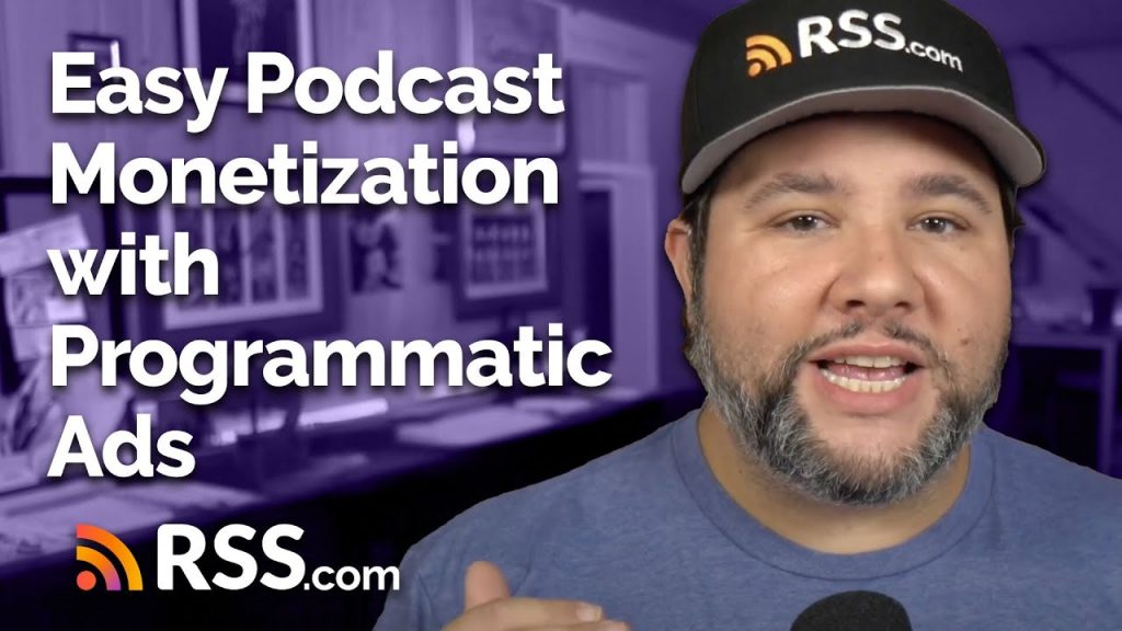
Here’s our original thumbnail our design team created for our recent video How to Monetize Your Podcast with Programmatic Ads:
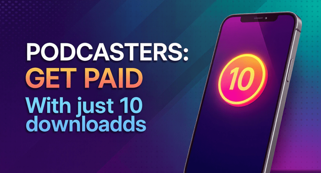
Here’s what Tuulie came up with for a faceless version of a thumbnail for the same video:
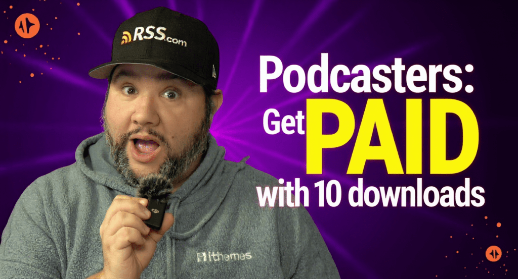
We then generated another version of our thumbnail with an image of our evangelist Joe Casabona, and here’s what Tuulie came up with:
You can create both versions in just minutes.
And, if you’re unhappy with the design, you can just use another credit to Re-Pop it by giving the program additional instructions on how to tweak it.
Other YouTube Thumbnail Tools
Free Options:
- GIMP provides advanced editing capabilities similar to Photoshop but without the cost
- Canva offers drag-and-drop design with numerous templates specifically created for YouTube thumbnails
- Canva Pro (paid) adds additional templates, brand kit features, and background removal tools
These options provide solid functionality for creators just starting out.
Paid Professional Tools:
- Photoshop remains the industry standard for professional thumbnail creation with complete creative control
- Figma is a decent option for team collaboration and systematic design processes, but there may be a significant learning curve figuring out how to use it for thumbnail creation
- Snappa focuses specifically on social media design with templates optimized for various platforms
Paid tools offer more advanced capabilities so choose tools based on your current skill level and time availability.
Simple drag-and-drop tools work well for beginners, while advanced editing software suits creators who want complete creative control.
YouTube Thumbnails Best Practices for Video Podcasts
Quick Implementation Checklist
Review each thumbnail against these criteria before publishing:
✅ Text under 50 characters and readable on mobile devices
✅ High contrast colors that stand out in search results
✅ Mobile-optimized design tested at actual thumbnail size
✅ Consistent brand elements that reinforce your channel identity
✅ Clear value proposition that matches your video content
✅ A/B testing plan to measure and improve performance
Maintaining Consistency Across Your Channel
We recommend you develop a template system that maintains visual consistency while allowing for content-specific variations.
Use consistent fonts, color schemes, and layout approaches that help viewers immediately recognize your content.
Include recognizable branding elements in each thumbnail without overwhelming the design.
This might be a consistent color scheme, logo placement, or visual style that appears across all your content.
Create series-specific visual themes for ongoing content series while maintaining overall channel consistency. It will help viewers understand your content structure while building anticipation for related episodes.
Viewers Judge Videos By YouTube Thumbnails
Effective thumbnails combine clear communication with psychological appeal.
Focus on creating designs that accurately represent your content while triggering the curiosity and interest that drives clicks.
With the right approach and tools, you can create thumbnails that significantly improve your video’s performance and help grow your audience.